Posts in Visual Identity & Graphic Design
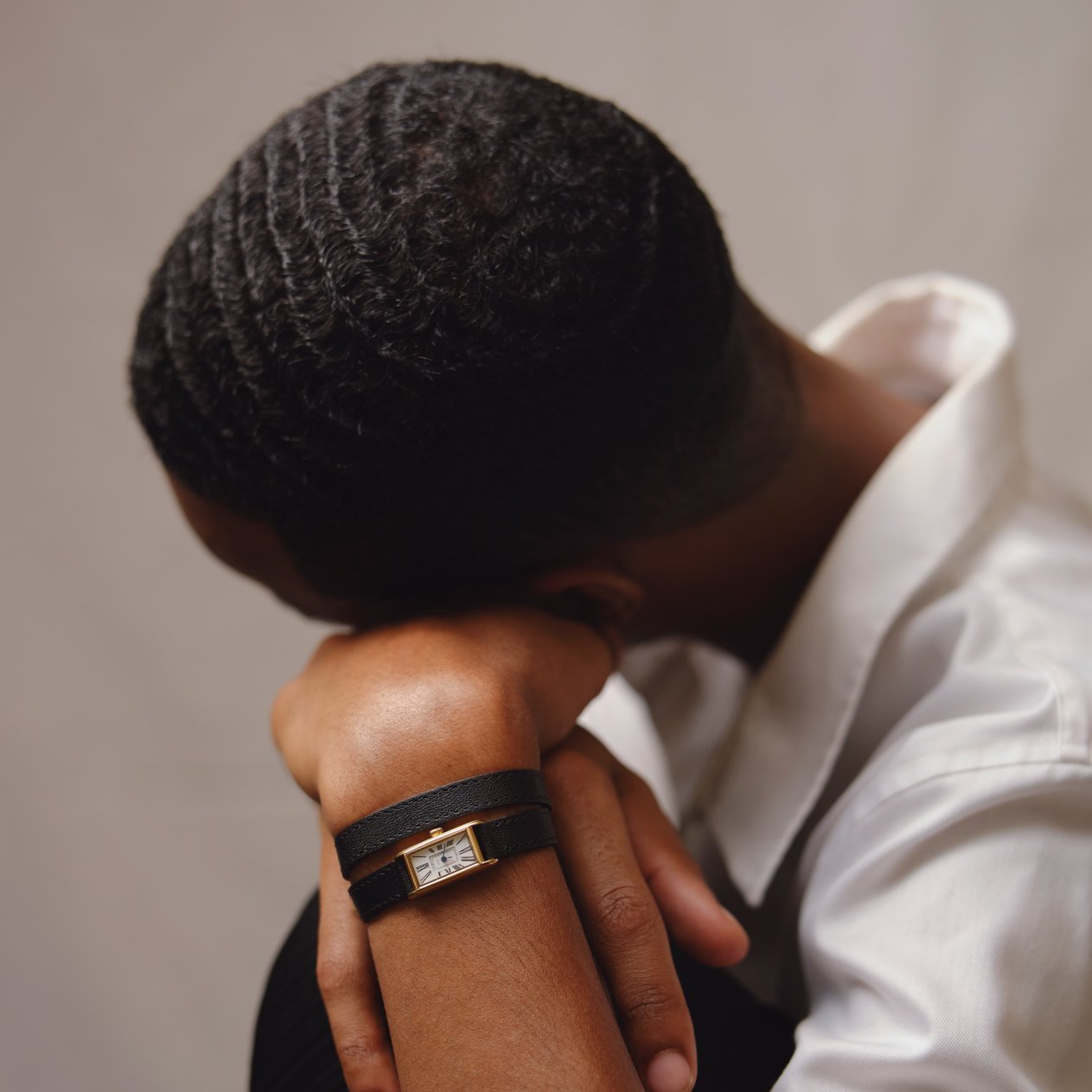
March Hare — Dial for watches, inspired by timeless timepieces

Mabel first contacted me for a print design project. Although we have never seen each other, the contact was very fluid from the start and it is very pleasant to work with her. She then asked me to "fix" some watch faces that she was preparing for another project: March Hare.

Although I never worked on this kind of project, I loved doing it and the two models released for the first collection are now officially launched!

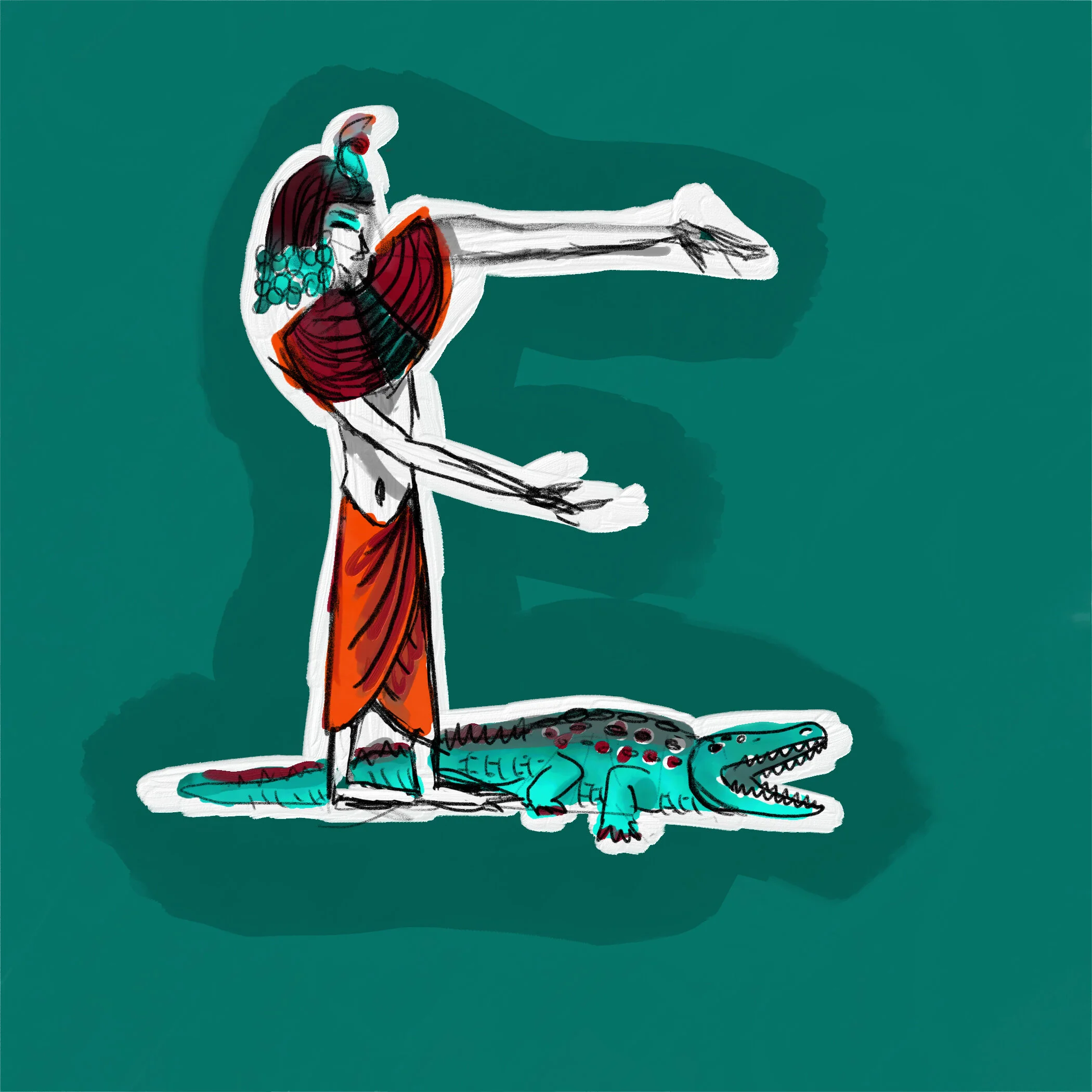
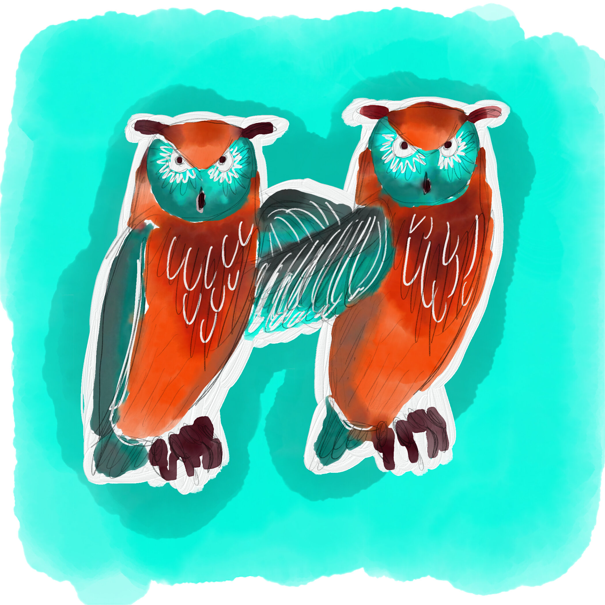
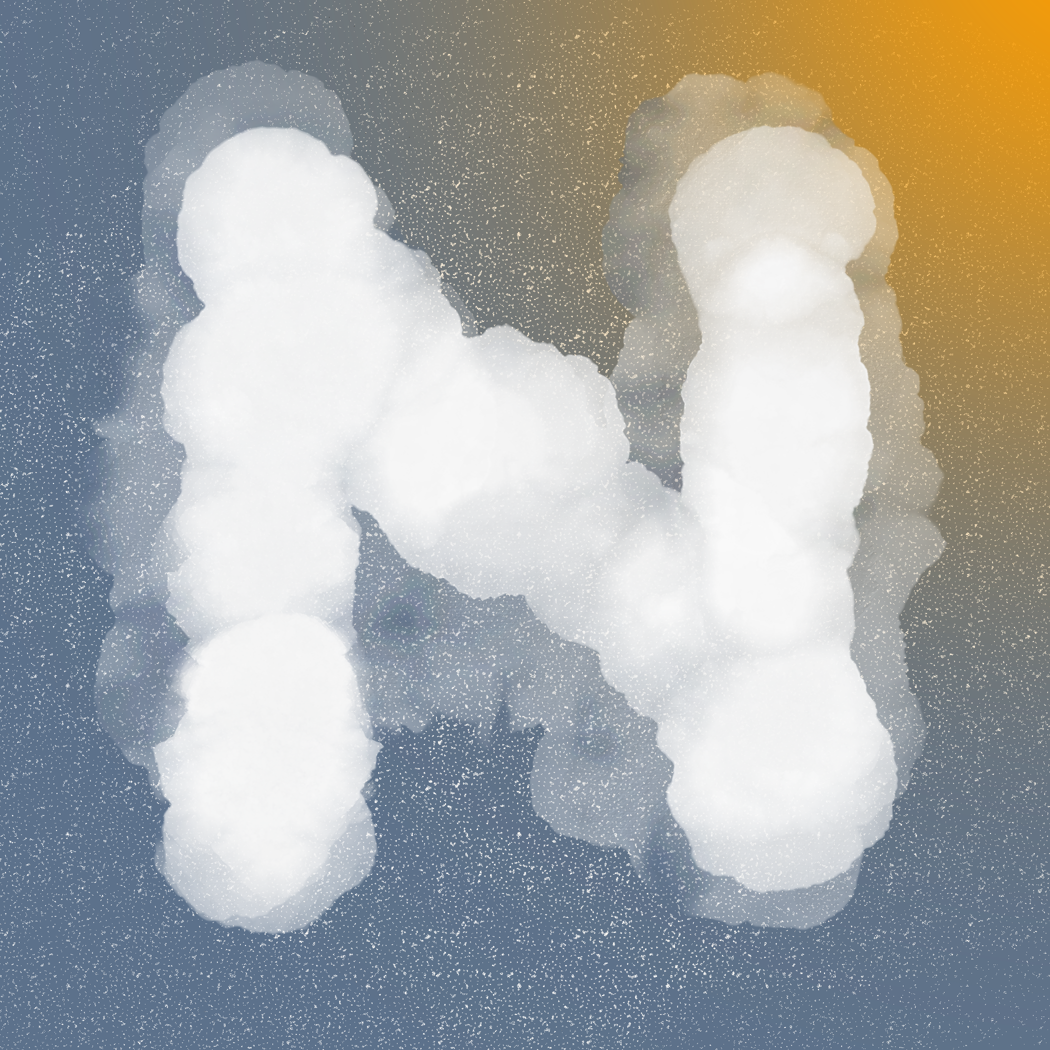
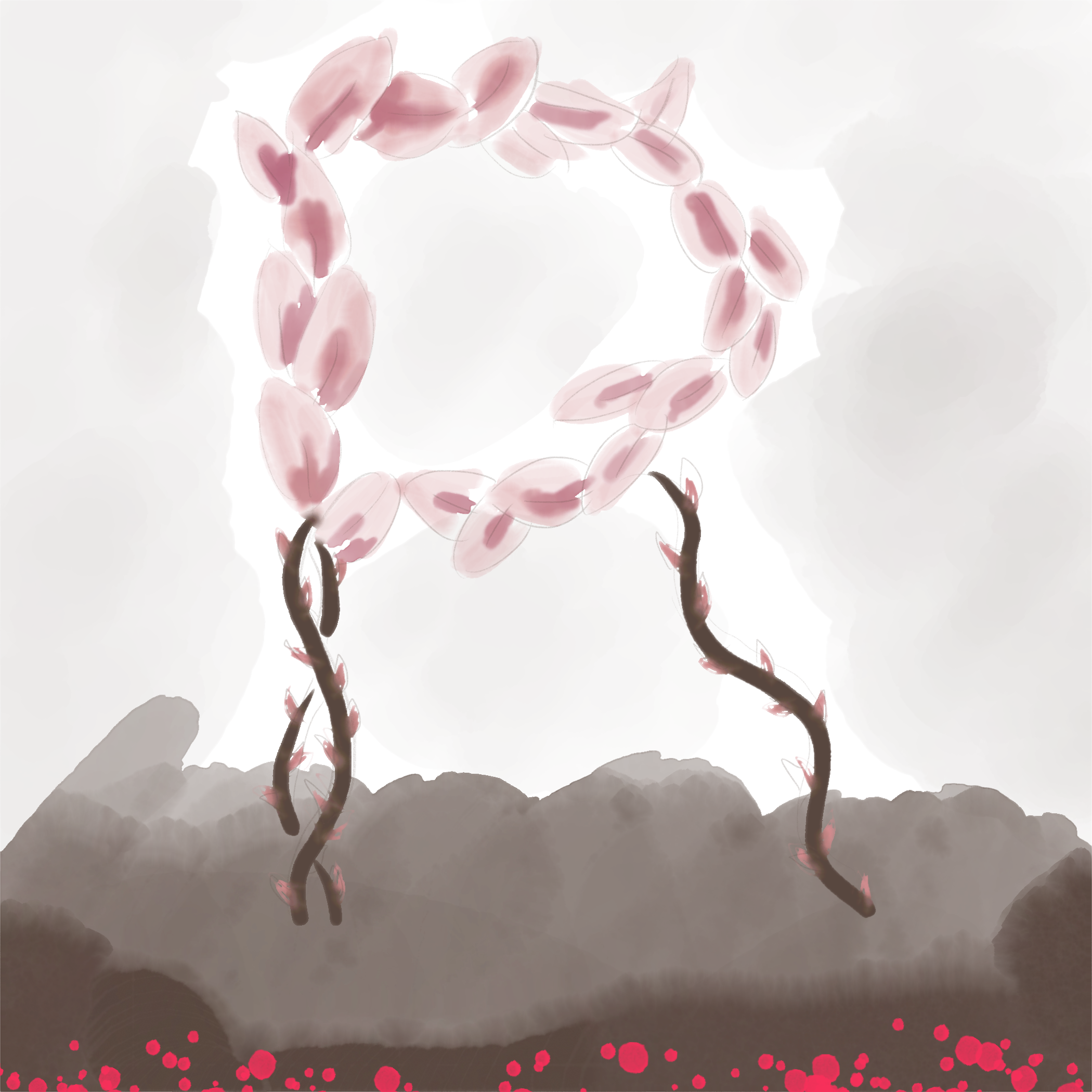
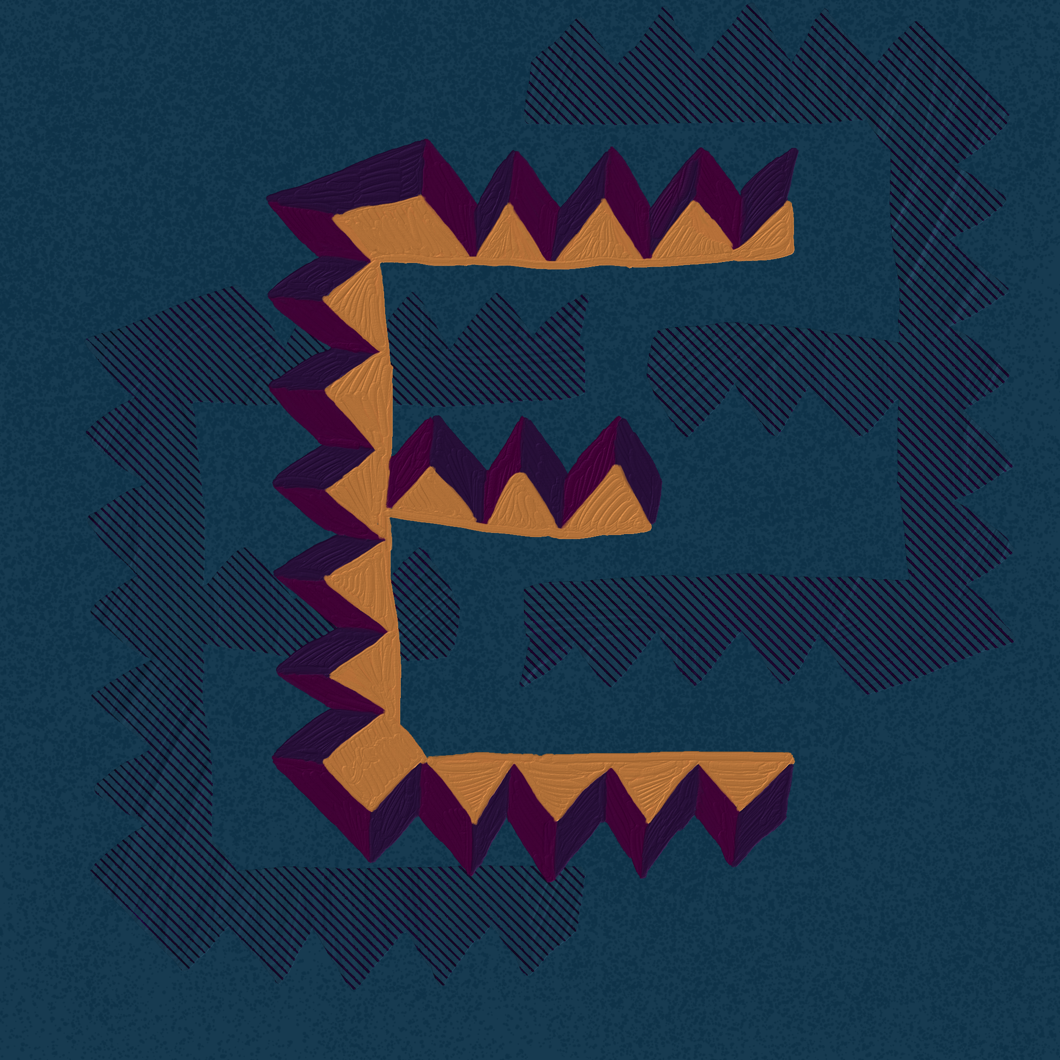
Studio Blanquette — Watercolour Lettering (Adobe Fresco)

Lockdown oblige… I’m testing new apps on my iPad Pro. They are amazing. I have never been very fond of hand-drawing, but this Adobe Fresco is a revolution for me. Except for the sound, which can easily be solved with some textured sticker of the screen, you actually have a real hand-drawing experience, with the bonus of digital drawing (“command + z” for example). Downloaded Procreate today, wait and see for the crash test :)

This alphabet is for my 3 years-old goddaughter. Love you Jeanne <3 You are the most incredible child I’ve ever met.

Coralie Prévert — dataviz prints

The new collection of silk scarves speaks about datavisualization, which is the graphical representation of statistical data.


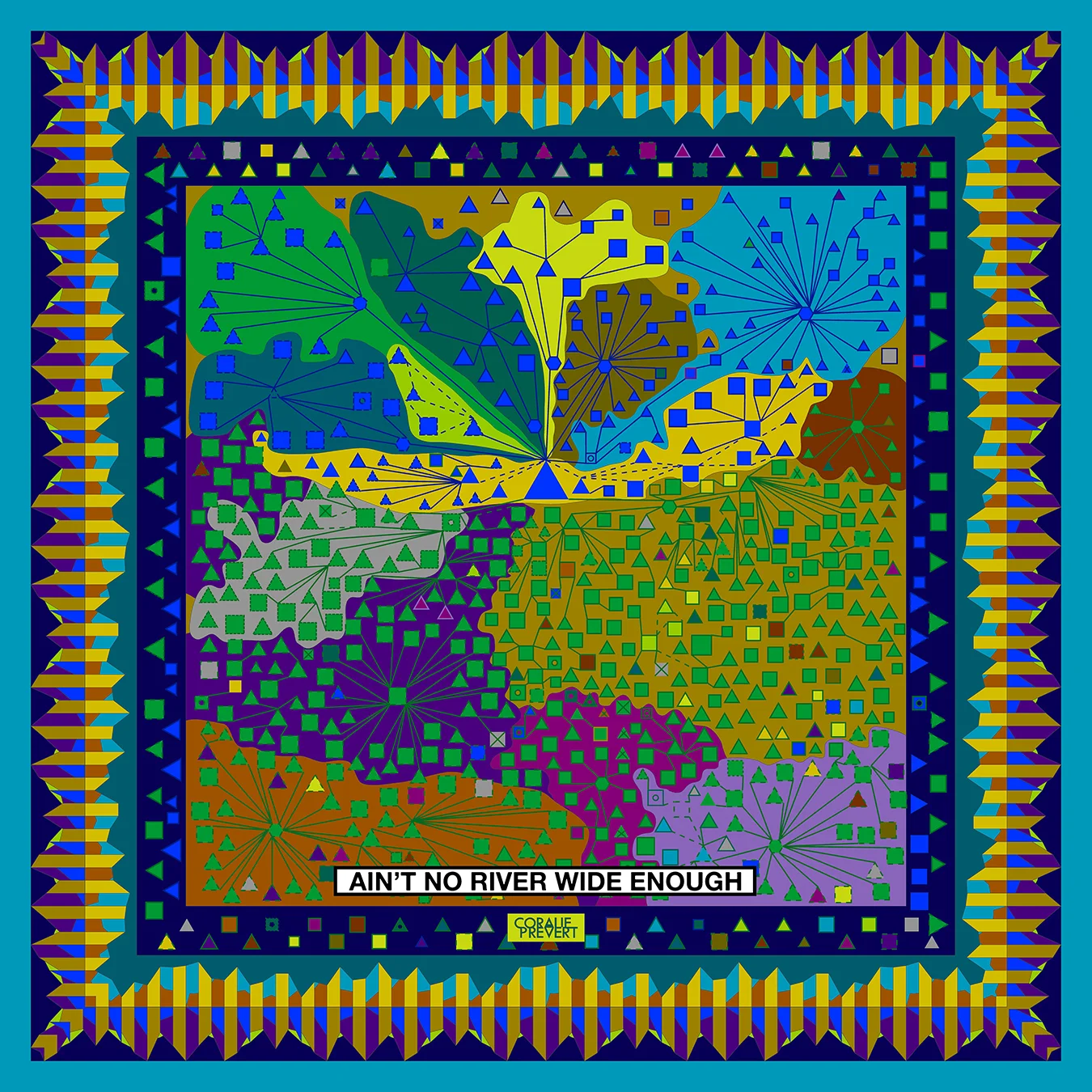
My Facebook friends

Since joining Facebook in September 2009, I've been building links that I've tried to analyze here.

Men in squares and women in triangles, whose size is proportional to the number of years since our connection, the "entities" in hexagons and color zones (cities, schools, workplaces, etc.). The Italians in green / purple, the French in blue / red (the other nationalities are grouped by continent), the family ties in dashes, the outlines according to the city where I met these people, a cross if I do not do not know in real life, everything is there!

The inner border of the scarf brings together my favorite friends and the outer border speaks of the chronology of the additions of friends, according to their gender, their nationality and the number of friends in common at that time.


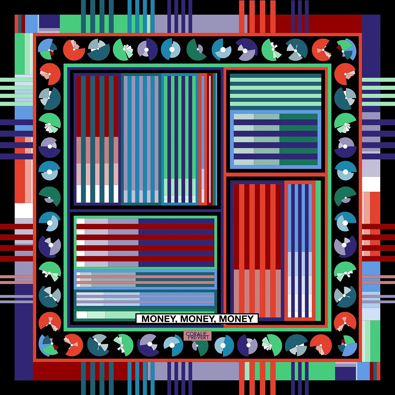
The houses I lived in

Thanks to the profession of my father, then to my Italian wanderings, I have moved many times since my birth, twenty in all. Here you will find the detail.

The height of the columns indicates the time I spent in one of the 20 houses I lived in. The different blocks that make up the columns represent the number of people living under the same roof. A triangle is a dog, two triangles, a cat, a small line, nothing. The small yellow or white columns speak of the average temperature and those which are a little thicker, orange, of the average rainfall of the city in question whereas the colored zone indicates the region.

The bubbles of the scarf border are proportional to the distance between one house and the other.

Interesting fact: I discovered that humidity is higher in Florence than in Normandy ...


Incomes & expenses

Delicate subject, but everything started from there.

My bank proposes to classify, then to visualize my expenses and incomes in the form of colored charts or pie charts. That's what you see on the edge of the scarf.

Professional / Personal, expenses / income, transportation, outings, sales of scarves, registrations to designer markets, housing, freelance work, travel, you have everything in front of you, I'll let you guess what color each category is represented and where is Uber ...

Coralie Prévert — visual identity
coralie_prevert_paris_logo.png

This might be a little "easy" but when it comes to design something for yourself (your own brand), nothing is really "easy".

Even less when the brand is your own name. It's been a life that you were thinking about self branding, even before the name "self branding" was created. C & P in French aren't easy: "CP" is the class you study when you're 6. Non sense. "PC", well... it means the same as in English.

I tried to put them together, but nothing. 

Then, I realized that they contain the same number of letters: 7. And since the central letters were A & V, instead of starring C & P, I had to focus more logo on them.

 
Squared version for social networks profils.

Squared version for social networks profils.


Other missions for the same client

  • Print design

  • Packshot pictures

  • Website