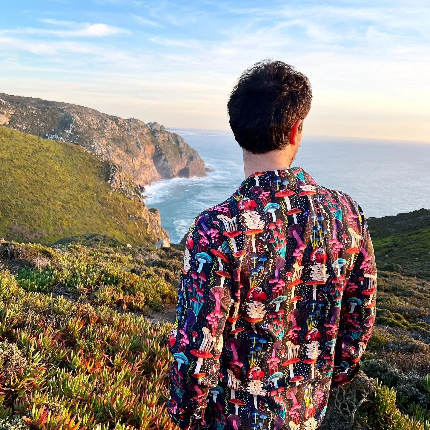
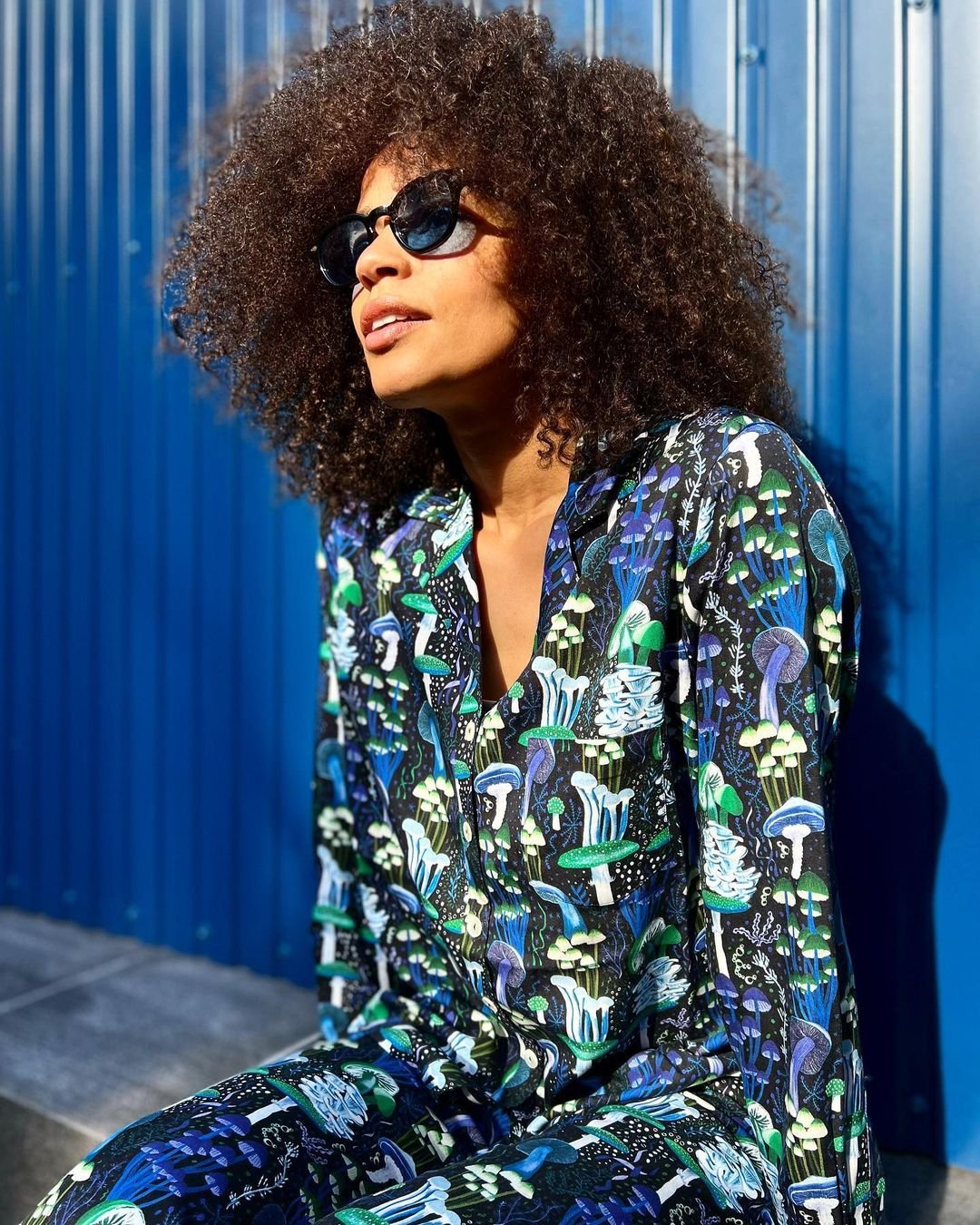
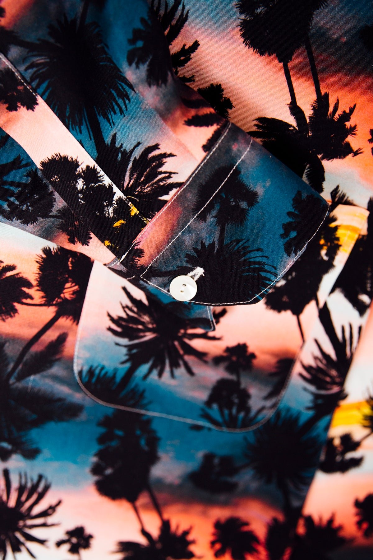
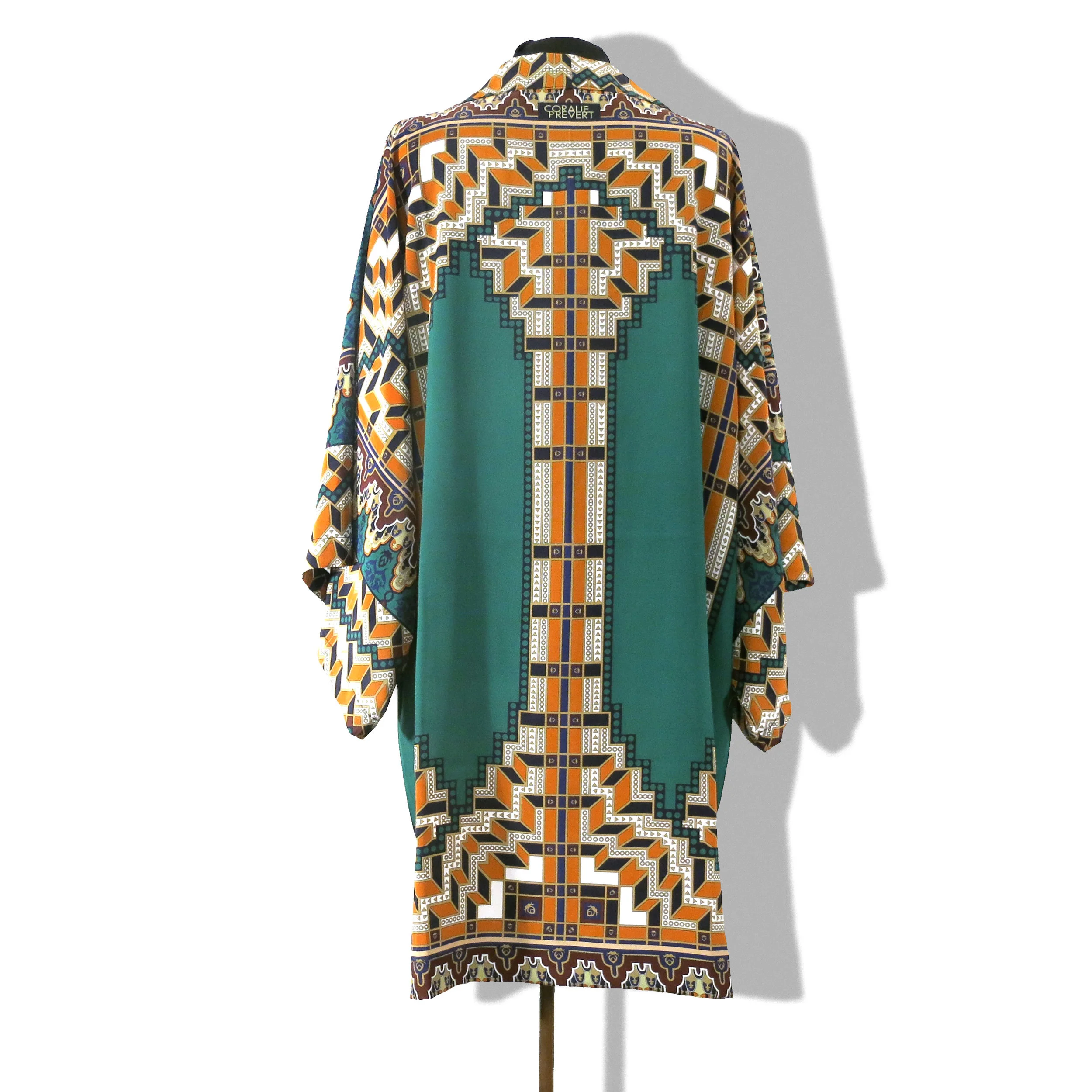
Ricardo and Luis are architects and decide to launch their lifestyle brand, based in Lisbon. They were looking for punchy prints. It was a pleasure to work with them and I am delighted with the result!
I met Marie a few years ago when she called me to sell in her shops the silk kimonos she had seen worn by a friend of hers.
She contacted me because she had in mind a celebratory scarf for the 20th anniversary of By Marie, her lifestyle brand. We ended with these two designs: optical and flowers.
I really love the colors she chose, it gives the silk scarves a cozy feel.
The printing factory I recommended for these scarves is the one I normally work with for my scarves. They were perfect as usual!
credits ©Aquazzura
While working together to create prints for the next collection, Edgardo have asked me to design a print for the tablecloth of his coming soon Capri dinner, celebrating the opening of the island shop.
Very happy to work with Cécile, the AD of this brand.
Bourrienne is a French brand that designs beautiful luxury white shirts. Cécile, whom I met years ago in a coworking place, wanted a chic and colorful scarf to accompany the shirts.
They gave me a rough design that they made from the magnificent ceiling of the Hôtel de Bourrienne, in the 10th arrondissement, where their offices are located. I adjusted it to make it printable. And then I worked on the color variants.
The printing factory I recommended for these scarves is the one I normally work with for my scarves. They were perfect as usual!
Inspiration from all over the world.
One of my favorite client, Ambre is really kind and cute.
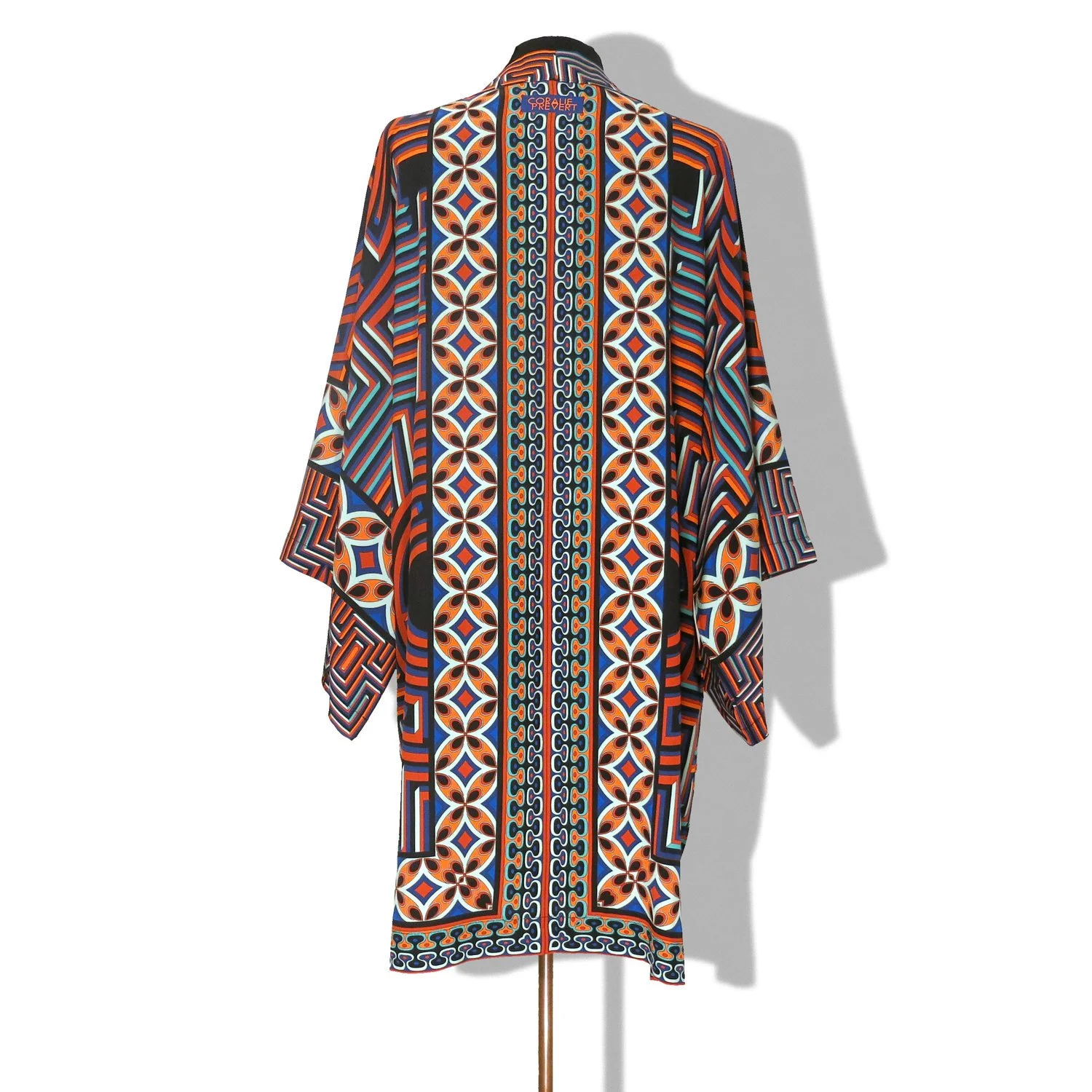
Contemporary placed deco geometric prints, full of colors and architecture references. African kanga inspired. Hand sewed.
The new collection of silk scarves speaks about datavisualization, which is the graphical representation of statistical data.
My Facebook friends
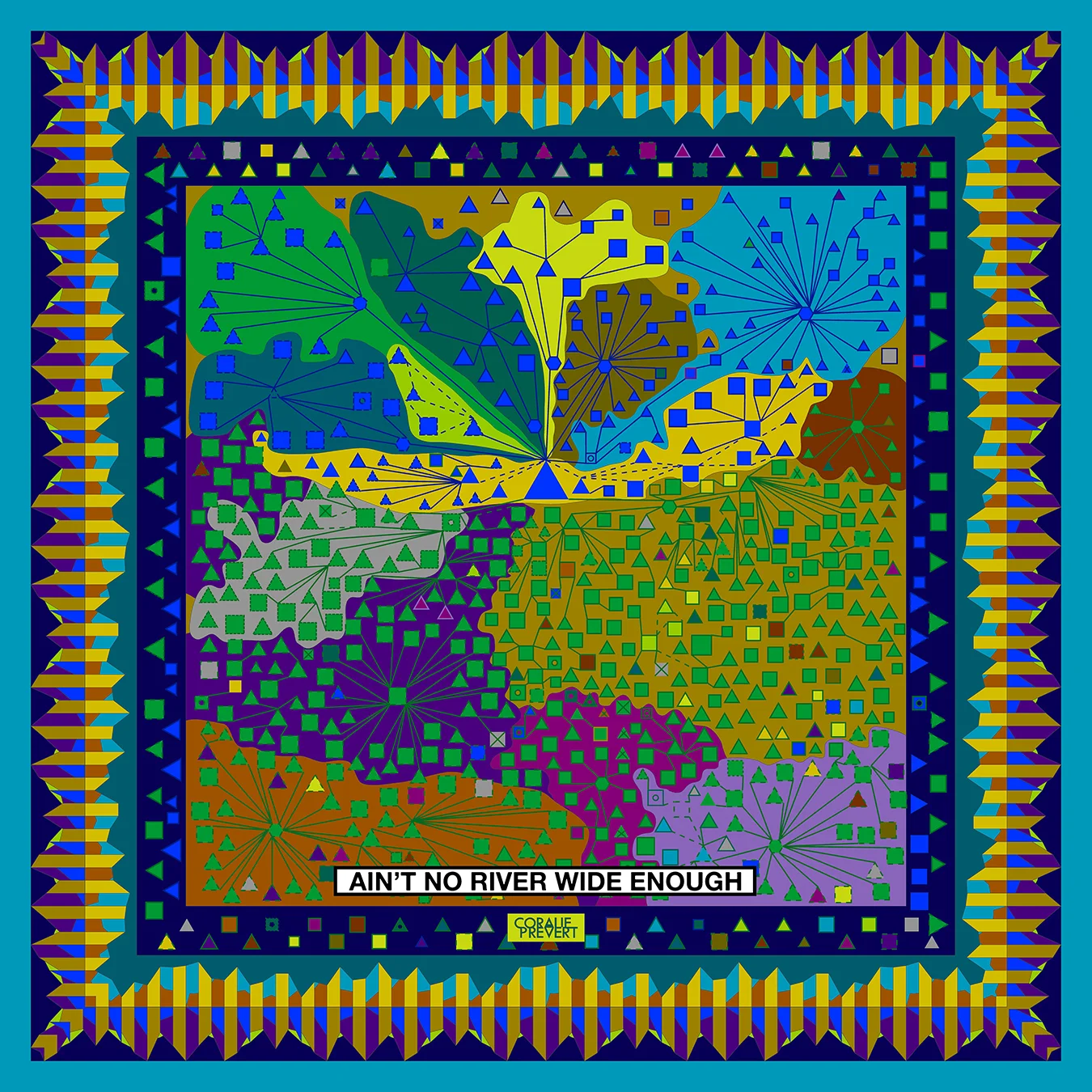
Since joining Facebook in September 2009, I've been building links that I've tried to analyze here.
Men in squares and women in triangles, whose size is proportional to the number of years since our connection, the "entities" in hexagons and color zones (cities, schools, workplaces, etc.). The Italians in green / purple, the French in blue / red (the other nationalities are grouped by continent), the family ties in dashes, the outlines according to the city where I met these people, a cross if I do not do not know in real life, everything is there!
The inner border of the scarf brings together my favorite friends and the outer border speaks of the chronology of the additions of friends, according to their gender, their nationality and the number of friends in common at that time.
The houses I lived in
Thanks to the profession of my father, then to my Italian wanderings, I have moved many times since my birth, twenty in all. Here you will find the detail.
The height of the columns indicates the time I spent in one of the 20 houses I lived in. The different blocks that make up the columns represent the number of people living under the same roof. A triangle is a dog, two triangles, a cat, a small line, nothing. The small yellow or white columns speak of the average temperature and those which are a little thicker, orange, of the average rainfall of the city in question whereas the colored zone indicates the region.
The bubbles of the scarf border are proportional to the distance between one house and the other.
Interesting fact: I discovered that humidity is higher in Florence than in Normandy ...
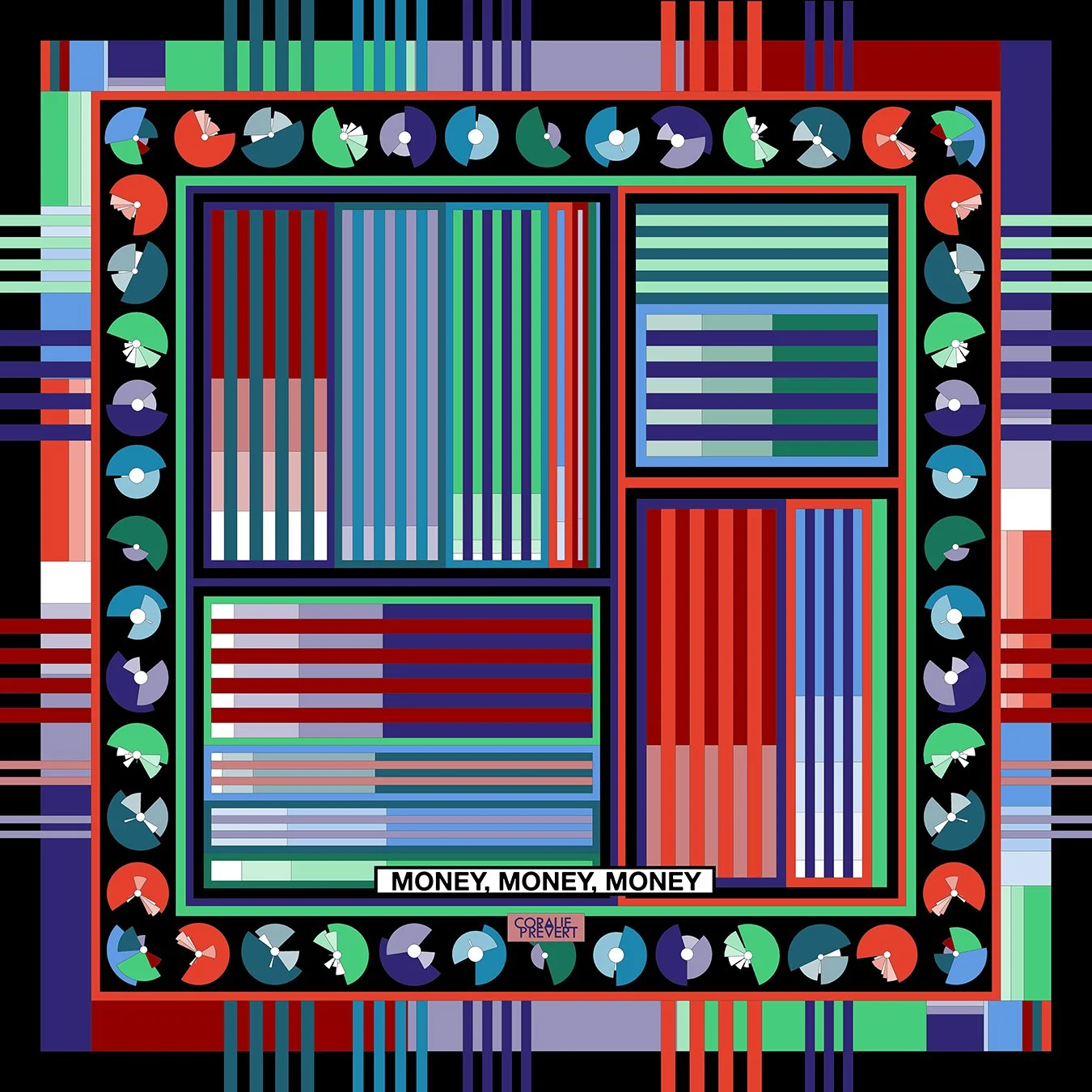
Incomes & expenses
Delicate subject, but everything started from there.
My bank proposes to classify, then to visualize my expenses and incomes in the form of colored charts or pie charts. That's what you see on the edge of the scarf.
Professional / Personal, expenses / income, transportation, outings, sales of scarves, registrations to designer markets, housing, freelance work, travel, you have everything in front of you, I'll let you guess what color each category is represented and where is Uber ...
Briefing in Paris, by adorable Alexis Temomanin, Art Director for this project.
The initial brief is about family, food and art.
We - Art Director for fashion Sophia Hedjeres and I, have to imagine a concept working for the whole uniform design, new apron/shirts/accessories garments for the worldwide team and create a new prints collection, inspired by Nando's historical roots and artistic heritage.
As the prints are not produced yet, here is the "Salon des Refusés"*.
* "Exhibition of Rejects", read here for more explanations
Twinny Pins is a fresh new brand for... pins!
Again, Art Director was Sophia Hedjeres, and I created the logo.
As it is a coming-soon project, I can't show anything...
April 2018 update
The reason why I still can't show anything is because since November, I'm still waiting to be payed by Sophia Hedjeres, who is a fucking thief...
Twinny Pins is a fresh new brand for... pins!
Again, Art Director was Sophia Hedjeres, and I designed the shapes and picked the colors.
As it is a coming-soon project, I can't show anything...
April 2018 update
The reason why I still can't show anything is because since November, I'm still waiting to be payed by Sophia Hedjeres, who is a fucking thief...


